About Brand
MotoMax is a specialized store for motorcycle parts and accessories, serving all motorcyclists with passion and expertise. We offer a variety of high-quality products and personalized service to ensure that customers find the ideal solutions for their bikes. MotoMax is the trusted partner in the world of two-wheelers.
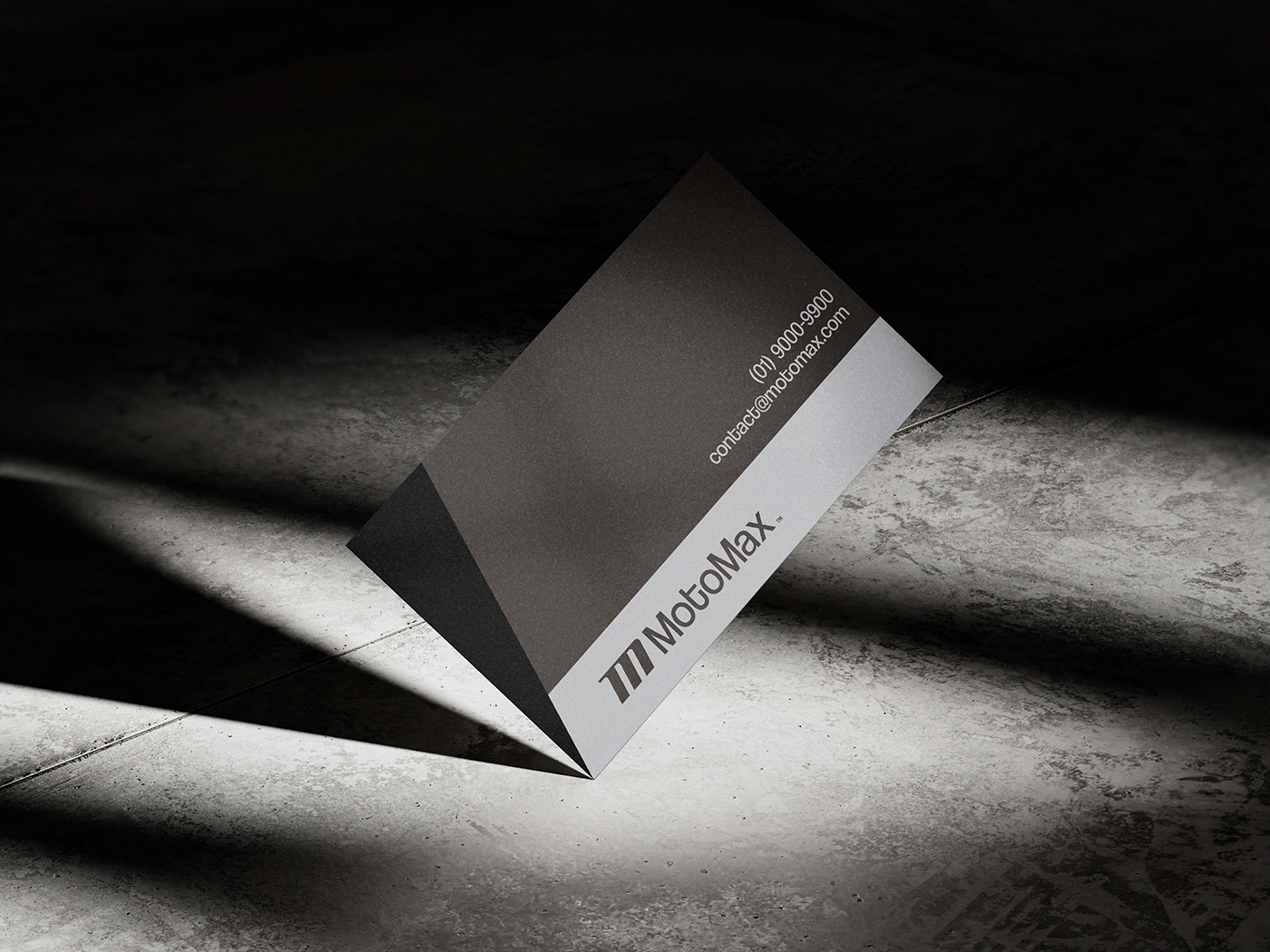
Client: MotoMax | Service: Visual Identity & Motion | Country: João Pessoa, Brazil | Year: 2023 |
Art Director: Gean Borge; Motion designer: Gustavo Henrique


Logo Rationale
MotoMax is a specialized store for motorcycle parts and accessories, serving all motorcyclists with passion and expertise. We offer a variety of high-quality products and personalized service to ensure that customers find the ideal solutions for their bikes. MotoMax is the trusted partner in the world of two-wheelers.


Grid
The symbol was created based on the golden ratio, which provides a natural and fluid distribution. We used a grid with lines at 70 degrees to give a sense of movement. This gives the design a more dynamic and contemporary appearance.
.


Typography
"Coolvetica" is the Sans Serif typeface that was used to create the logo. This font was tweaked in order to keep the shapes that indicate a modern, profesional and flexible brand. The optical adjustment was also used between the letters, visually establishing a fit which in turn makes reading more appealing.

Colour Palette
Our team chose a color palette centered around shades of gray and brown, with various gray tones for versatile applications. This allows us to convey a sense of technology and innovation through gray, while brown evokes stability and comfort. These colors provide us with a wide range of possibilities to creatively express the brand's essence.

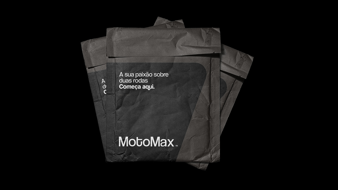
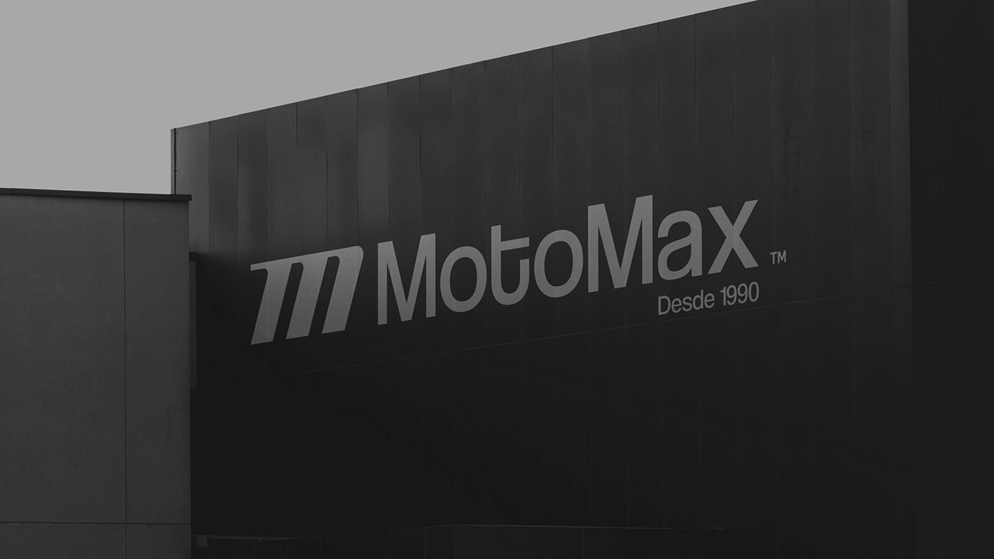
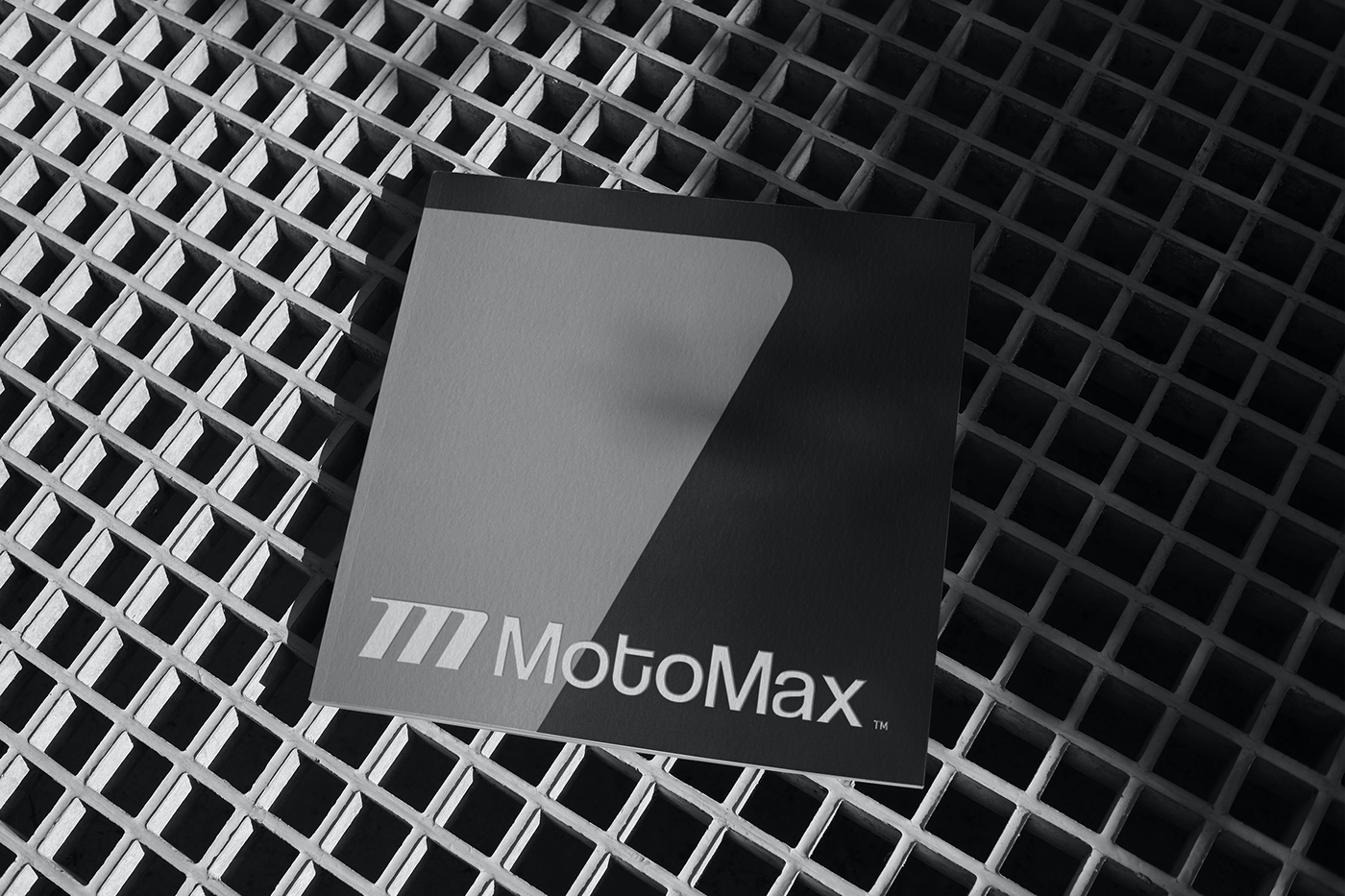
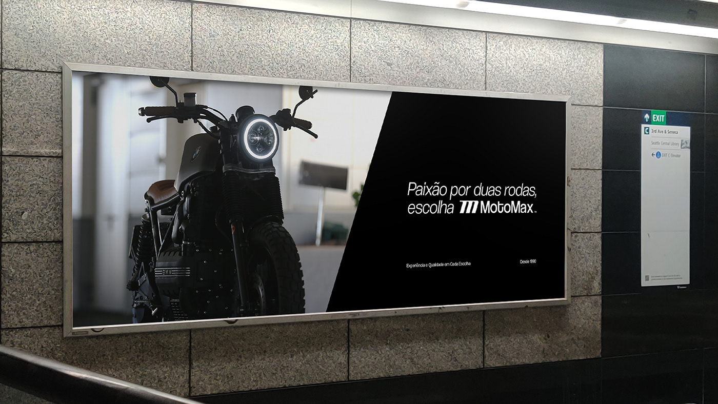
Brand Application
The MotoMax application has been designed with elegance and simplicity, delivering an innovative and user-friendly experience for our customers.